

Case Study: Frankenstein—Book Cover Reimagining
Context:
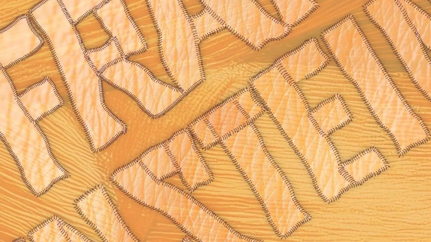
Some stories are so iconic that their imagery can overshadow their deeper meaning. For this reinterpretation of Mary Shelley's Frankenstein, I wanted to move beyond the familiar image of the monster and focus on the novel's true subject: the act of creation itself. Rather than illustrating the creature, I explored the tension between creator and creation, using typography and texture to symbolize a body assembled from fragments and brought to life.
My Role:
I developed the concept, lettering, illustration, cover design, and presentation mockups. My goal was to distill one of literature's most enduring themes into a single visual idea. Rather than depicting the creature itself, I focused on the process of creation, exploring how typography, texture, and materiality could embody the novel's questions about ambition, responsibility, and what it means to assemble life from fragments.
Result:
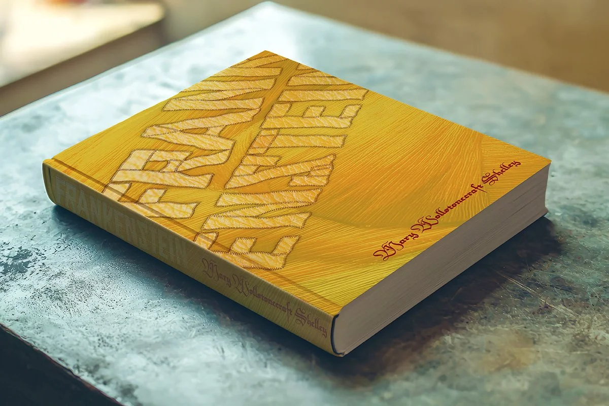
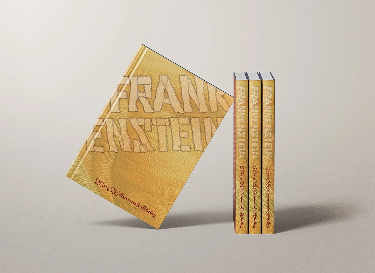
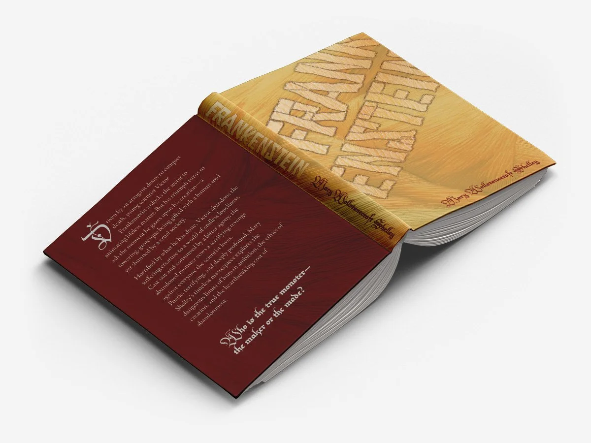
The final cover transforms the title Frankenstein into a reconstructed form, stitched together from individual pieces like the creature itself. Layered textures and hand-crafted details create a tactile, physical quality that supports the story's themes of ambition, experimentation, and humanity. The project includes a complete cover system, spine design, and three-dimensional mockups.
Reflection:
This project reinforced my belief that the strongest concepts often come from interpreting a story rather than illustrating it. Instead of showing readers what the creature looks like, I wanted them to experience the idea of the creature through the design itself. What makes this piece special to me is that every visual decision supports a single narrative concept: a book about creation that is, quite literally, constructed from parts.
