Who Knew Data Could be so Compelling?!?!?!
INFOGRAPHICS
Overview:
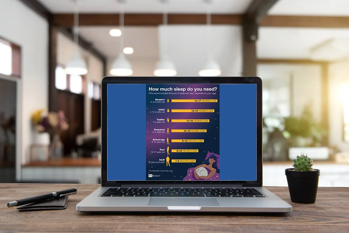
NHLBI How Much Sleep Do You Need Infographic
Context:
This infographic communicates recommended daily sleep ranges across different age groups, from newborns to adults. The goal was to present health information in a way that feels approachable, easy to scan, and visually calming.
My Role:
I designed the layout and visual hierarchy, translating clinical data into a clear, friendly graphic using icons, color, and typography to guide the viewer through each life stage.
THE TEAM
Client: NHLBI
Creative Director: Ody Leonard
Science Writer: Shira D. Gordon
https://shiradgordon.com/
Result:
A vertically structured infographic that allows readers to quickly locate their age group and understand how much sleep they need. The nighttime color palette and simple silhouettes support the message while keeping the focus on the data.
Reflection:
This piece shows how thoughtful design can make complex health guidelines feel accessible. By balancing clarity with visual warmth, the infographic turns information into something people can actually use.