

Mental Health & Self-Care Social Media Carousel
Context:
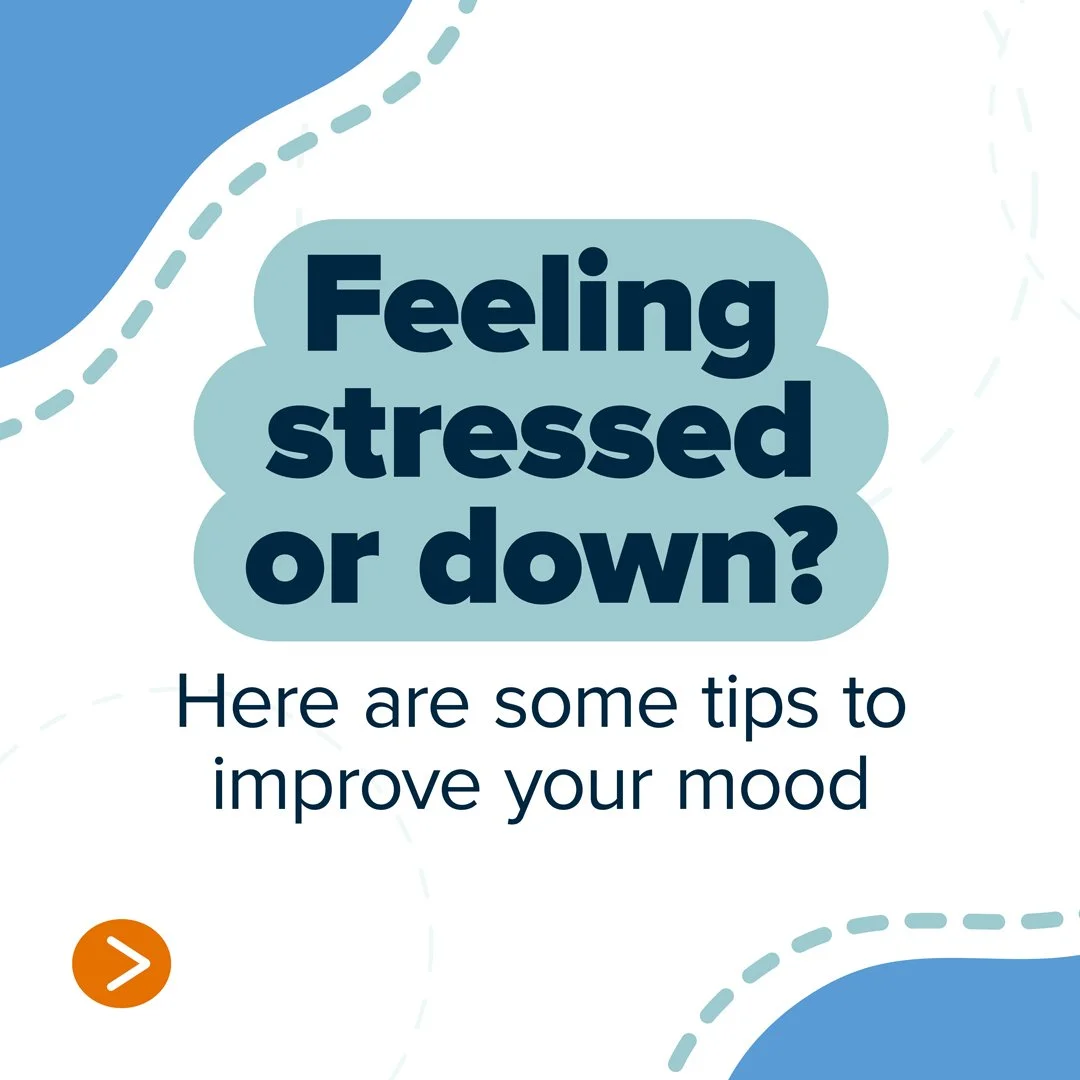
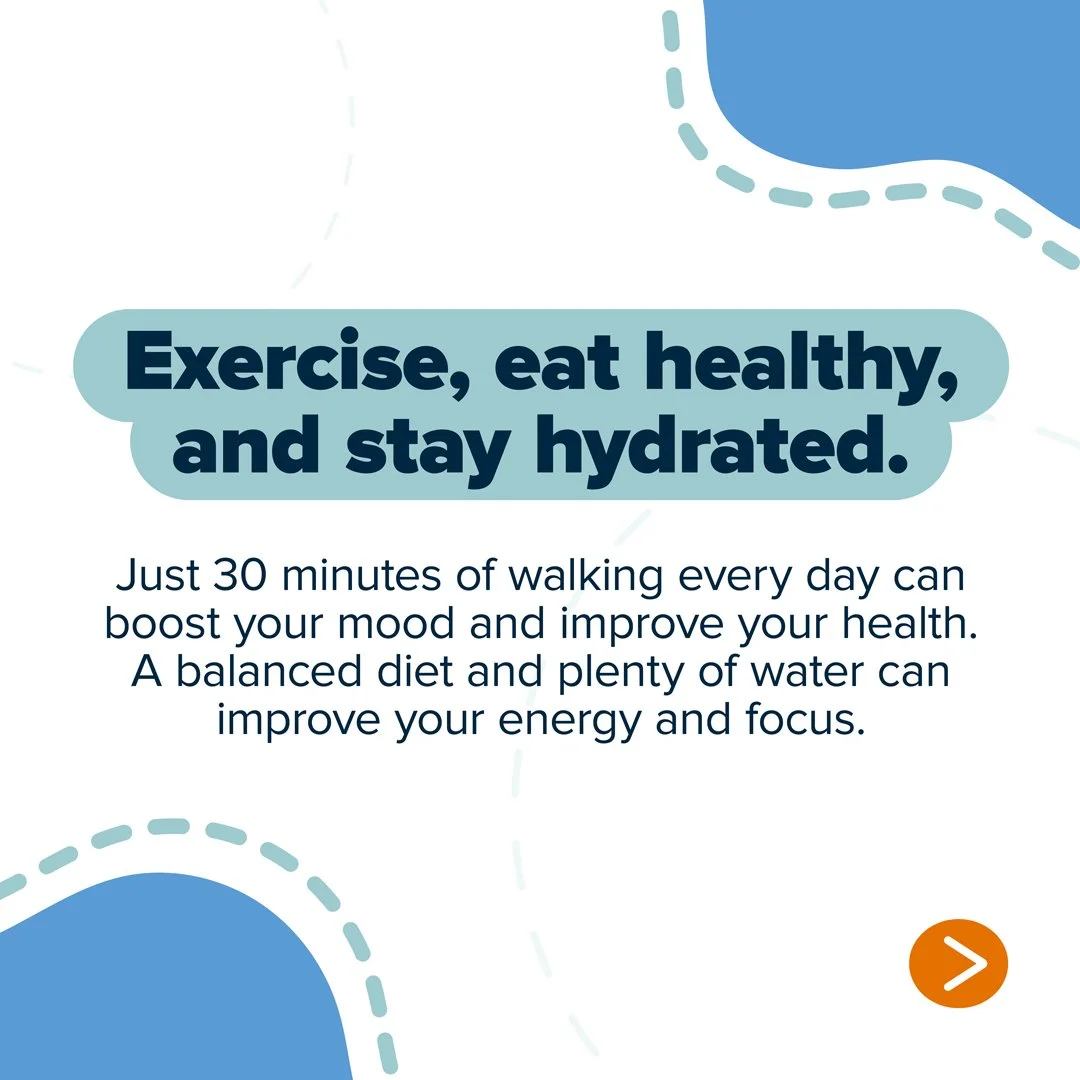
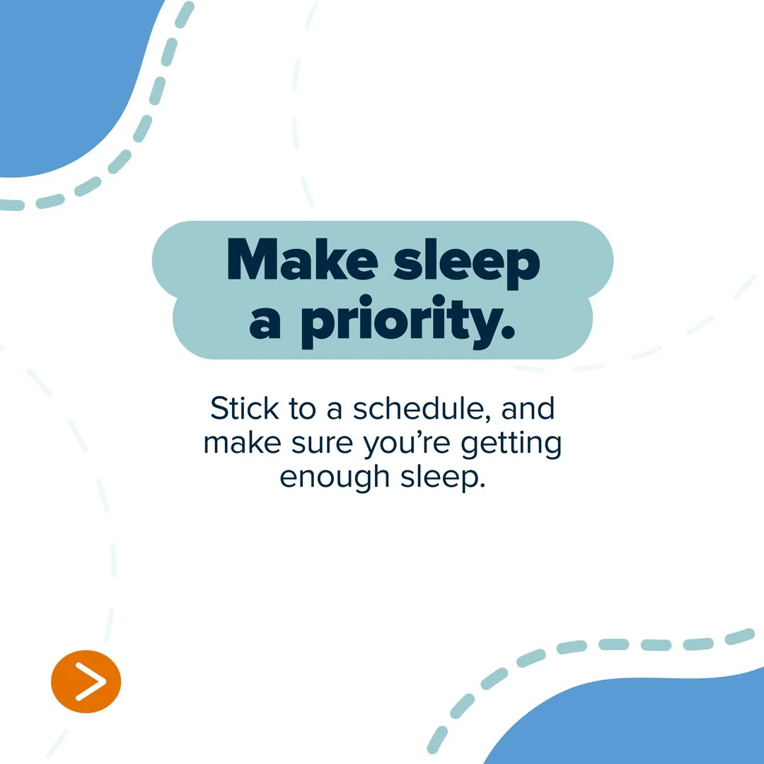
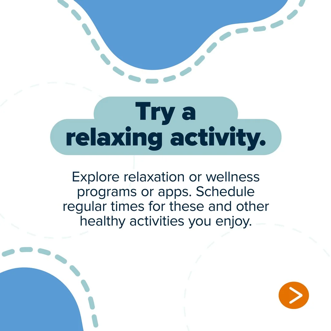
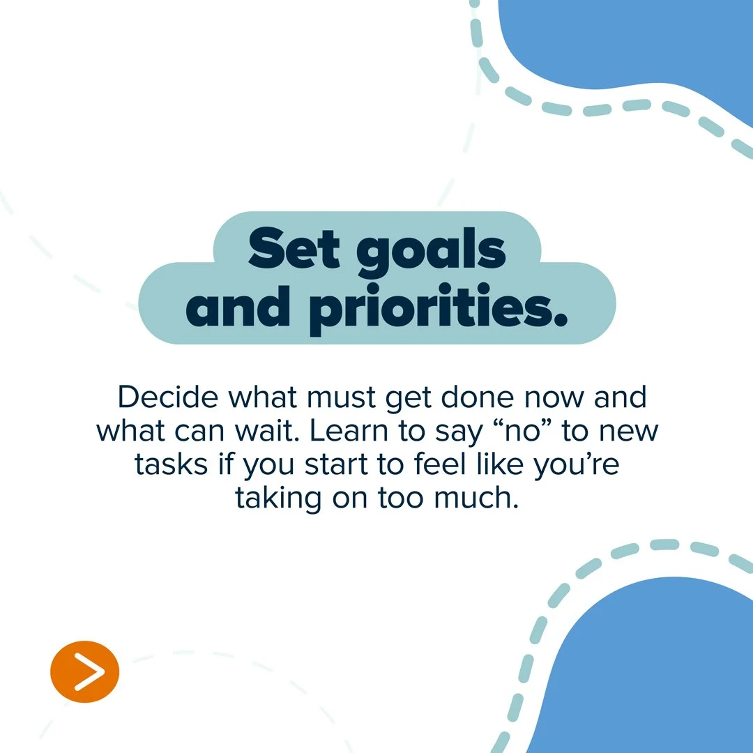
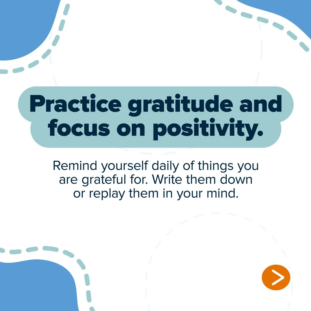
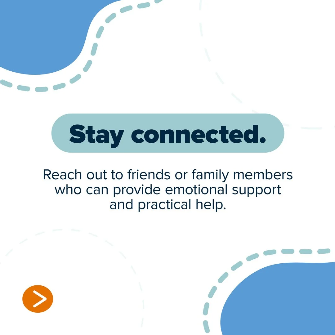
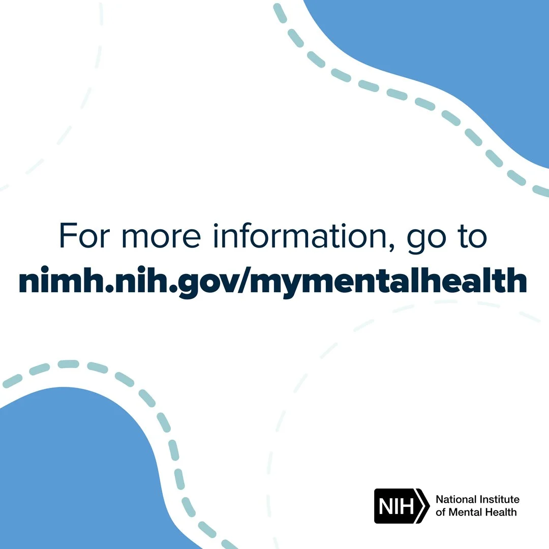
A social media carousel and animation designed to make mental health and self-care guidance feel clear, approachable, and easy to act on. Each slide focuses on one practical action, leading viewers from simple wellness tips to additional NIMH resources.
My Role:
I designed the visual concept, typography, layout, color system, graphic elements, and carousel structure. My focus was on creating a friendly, accessible visual language that could make health information feel less clinical while keeping the content clear, credible, and easy to navigate.
Result:
Established a clear hierarchy using bold, action-oriented headlines followed by short supporting information.
Created a cohesive visual system of organic shapes, soft blues, dashed lines, and a contrasting orange navigation element to give the series a recognizable rhythm.
Designed for quick comprehension, keeping each slide focused on one self-care action rather than presenting too much information at once.
Built continuity across the carousel by shifting the abstract forms from slide to slide while maintaining consistent typography, color, and structure.
Created a clear progression from the opening question through actionable tips to a final resource slide directing viewers to NIMH.
Reflection:
This project reinforced how thoughtful information design can make health communication feel more human. By simplifying the hierarchy and pacing the content, I created a system that helps important information feel manageable rather than overwhelming.
A Healthier America for All
Translating a print story into motion
Turning an information-rich brochure into a focused video story about nursing, health equity, and impact.
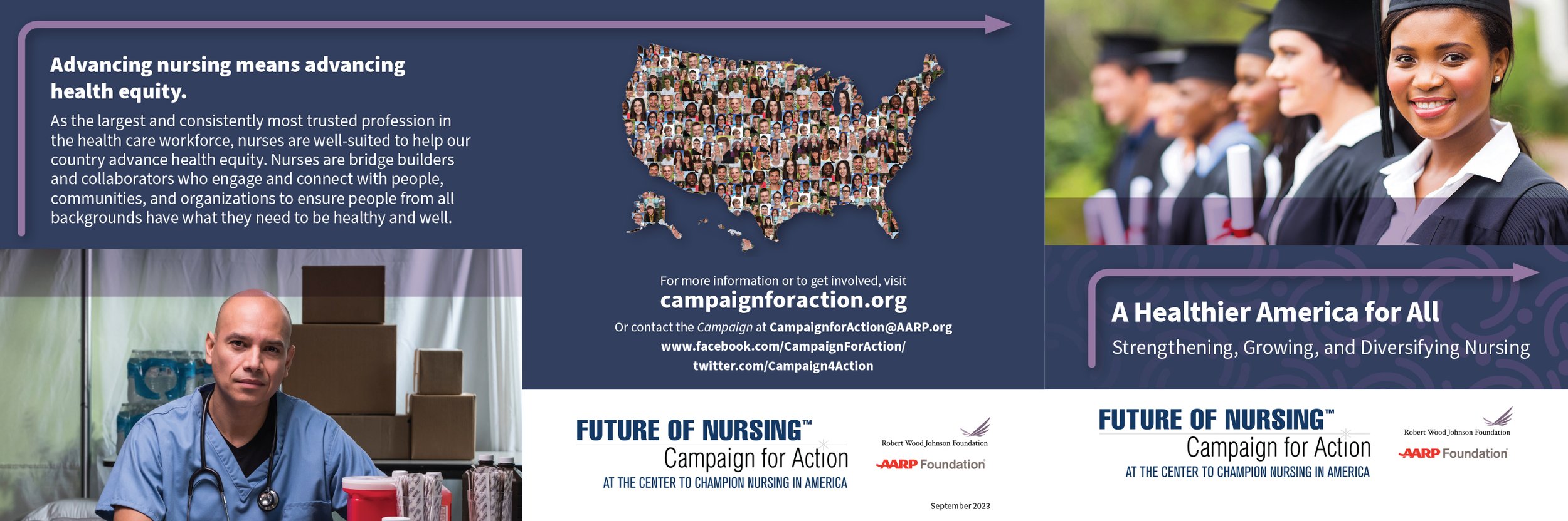
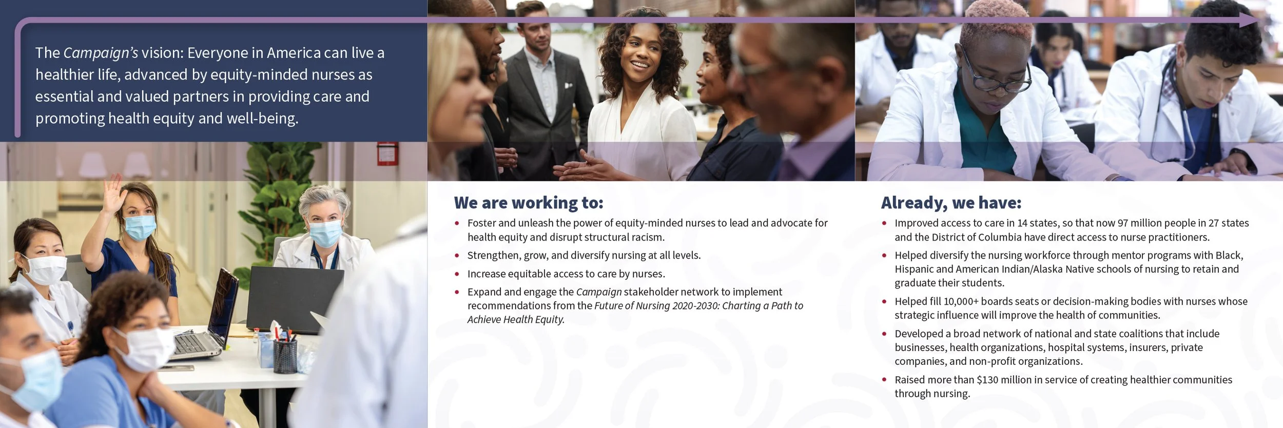
Context:
The project transformed an existing Future of Nursing: Campaign for Action brochure into a video experience. The challenge was to preserve the core message and visual identity while reshaping dense print content for a medium built around movement, pacing, and attention.
My Role:
I designed and translated the brochure from print to motion, developing the content hierarchy, visual flow, typography, imagery, pacing, and transitions.
Process:
Find the story: Distilled the brochure into its strongest messages and created a focused narrative.
Design for motion: Reworked long-form print content into concise, screen-friendly moments.
Extend the visual language: Carried the brochure’s typography, color, imagery, and graphic elements into motion.
Create the rhythm: Used pacing and transitions to connect ideas and guide viewers through the story.
Result: The final video gave the original brochure a new dimension, turning a content-heavy print piece into a more dynamic visual narrative while maintaining a clear connection to the campaign identity.
Reflection:
The project reinforced that adapting print to motion is about more than making static elements move. It’s about finding the essential story and redesigning the experience around how people watch, absorb, and connect with information.
Making the Data Matter
Short-Form Public Health Videos
Context:
A series of three short videos designed to translate CDC-sourced overdose statistics into clear, immediate visual stories. The challenge was to communicate serious public health data quickly without overwhelming the viewer.
My Role:
I developed the visual approach, typography, information hierarchy, pacing, and motion design, turning key statistics into concise, shareable video content.
Process:
Identified the statistic as the primary storytelling element.
Used scale and typographic contrast to give key numbers immediate impact.
Broke supporting information into a clear visual sequence.
Used motion and pacing to reveal information progressively and maintain focus.
Result:
The three videos transformed complex public health statistics into short, focused pieces designed for quick comprehension and digital engagement.
Reflection:
This project reinforced the power of clarity and restraint in data-driven design. With only seconds to communicate each message, every decision had to support the statistic and help viewers understand its significance.
Celebrating National Drug and Alcohol Facts Week
Short-Form Motion Design
Context:
A short video created to highlight the reach and participation of National Drug and Alcohol Facts Week (NDAFW). The goal was to turn participation statistics into an energetic visual story that communicated the scale of the initiative at a glance.
My Role:
I developed the visual concept, typography, information hierarchy, graphic elements, pacing, and motion design.
Process:
Prioritized key statistics to create a clear narrative.
Used scale, color, and bold typography to emphasize impact.
Introduced information progressively to keep the message easy to follow.
Added celebratory graphic elements and motion to reinforce the sense of reach and participation.
Result:
The final video transforms participation data into a concise, engaging story that celebrates NDAFW’s broad reach across states, countries, and territories.
Reflection:
This project reinforced how motion and typography can turn statistics into a story. By focusing on hierarchy, pacing, and visual energy, I was able to make the numbers feel less like data points and more like a representation of collective impact.
Bringing Science to Life
NIGMS Research Animal Coloring Page Videos
Context:
A series of five short videos (3 shown above) created to showcase NIGMS research animal coloring pages in a playful, engaging format. Each animation introduces the pages through movement, giving static educational materials a more dynamic digital presence.
My Role:
I developed the motion concept, composition, pacing, color treatments, and animation for the video series.
Process:
Used bold, textured backgrounds to give each video a distinct visual presence.
Animated the coloring pages as they enter the frame to create movement and anticipation.
Added a page-turn effect as the pages land, revealing the illustrations in a simple, tactile way.
Kept the animation concise so the coloring pages remained the focus.
Result:
The three-video series transforms printable science resources into lively, shareable digital content while keeping the original coloring-page artwork front and center.
Reflection:
This project showed how small moments of motion can make static content more engaging. The page-turn interaction adds personality and discovery without competing with the educational material itself.