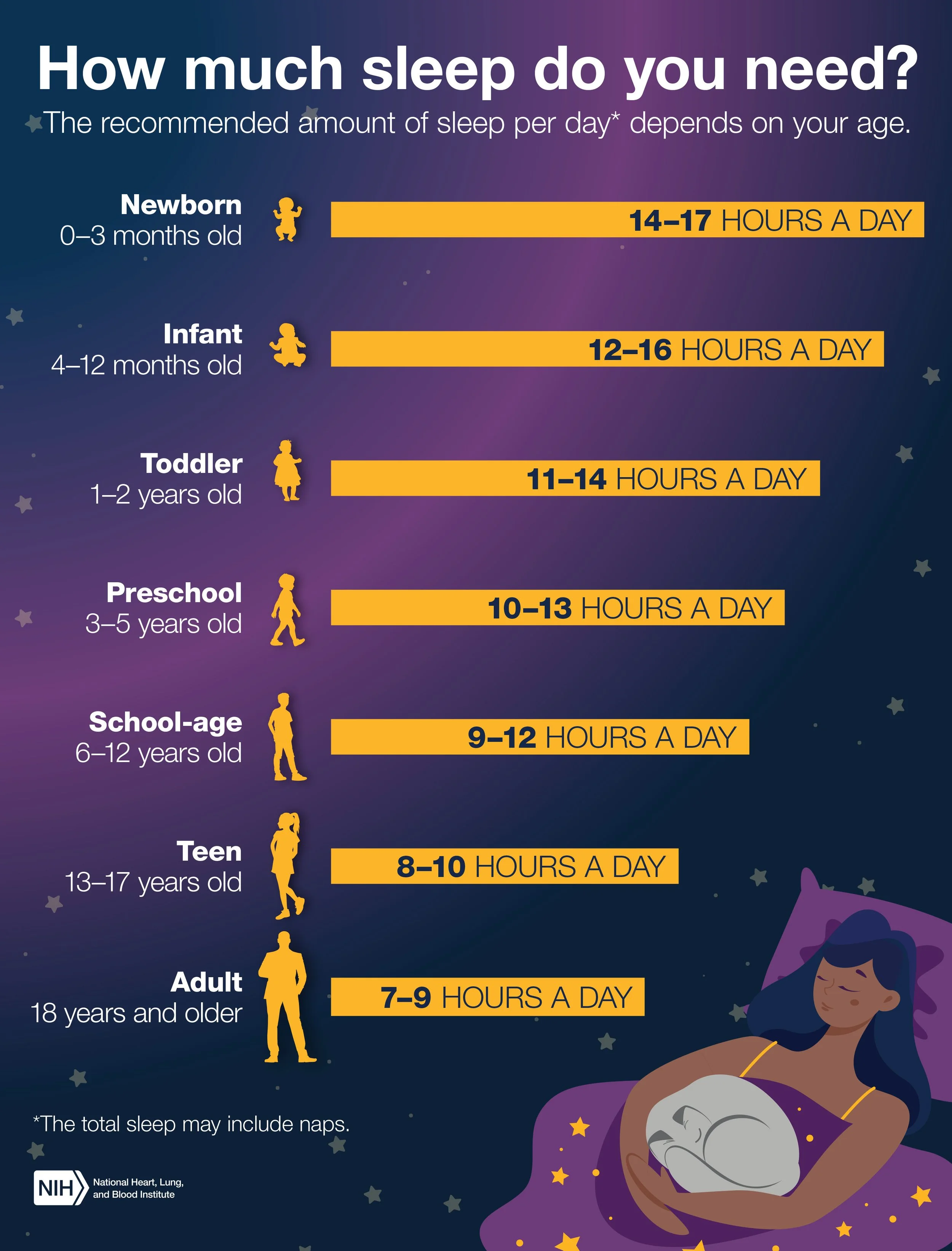
How Much Sleep Do You Need?
Health Information Design
Context:
An infographic created for the National Heart, Lung, and Blood Institute to communicate recommended daily sleep amounts across life stages, from newborns through adulthood. The challenge was to organize multiple age ranges and recommendations into a format that could be understood at a glance.
My Role:
I developed the visual concept, information hierarchy, typography, color palette, and overall infographic layout; I altered the Illustration to fit within the branding guidelines.
Process:
Organized the information by life stage to create a natural progression.
Used bold horizontal bars to make sleep recommendations easy to scan and compare.
Incorporated silhouettes to reinforce age groups without adding visual complexity.
Created a nighttime-inspired palette and supporting illustration to connect the information to sleep.
Result:
The final infographic transforms a series of health recommendations into a clear visual reference, using hierarchy, color, and illustration to make the information approachable and easy to navigate.
Reflection:
This project reinforced how good information design can simplify without oversimplifying. By giving the numbers a strong visual structure, the design helps viewers quickly find what is relevant to them while still seeing the bigger picture.
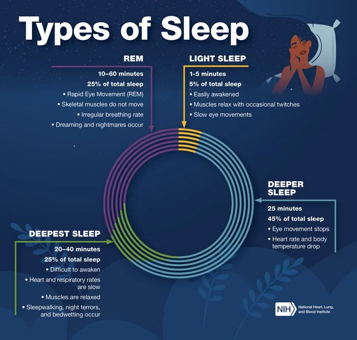
Types of Sleep
Health Information & Data Visualization
Context:
An infographic created for the National Heart, Lung, and Blood Institute to explain the different stages of sleep and the characteristics of each. The challenge was to organize multiple types of information, including duration, percentage of sleep, and physical characteristics, into one clear visual story.
My Role:
I developed the visual concept, information hierarchy, typography, color palette, and overall infographic layout; I altered the Illustration to fit within the branding guidelines.
Process:
Organized the content around a central circular visualization to reinforce the cyclical nature of sleep.
Color-coded each sleep stage to make the information easy to follow and compare.
Established a clear hierarchy between sleep stage, duration, percentage, and supporting details.
Used nighttime imagery and a restrained palette to create a cohesive visual environment without competing with the data.
Result:
The final infographic transforms detailed sleep information into an approachable visual guide, allowing viewers to understand each stage individually while seeing how the stages relate as part of a larger cycle.
Reflection:
This project reinforced how structure can make complex health information feel intuitive. The circular visualization does more than organize the content. It becomes the central storytelling device, connecting separate data points into a single, understandable system.
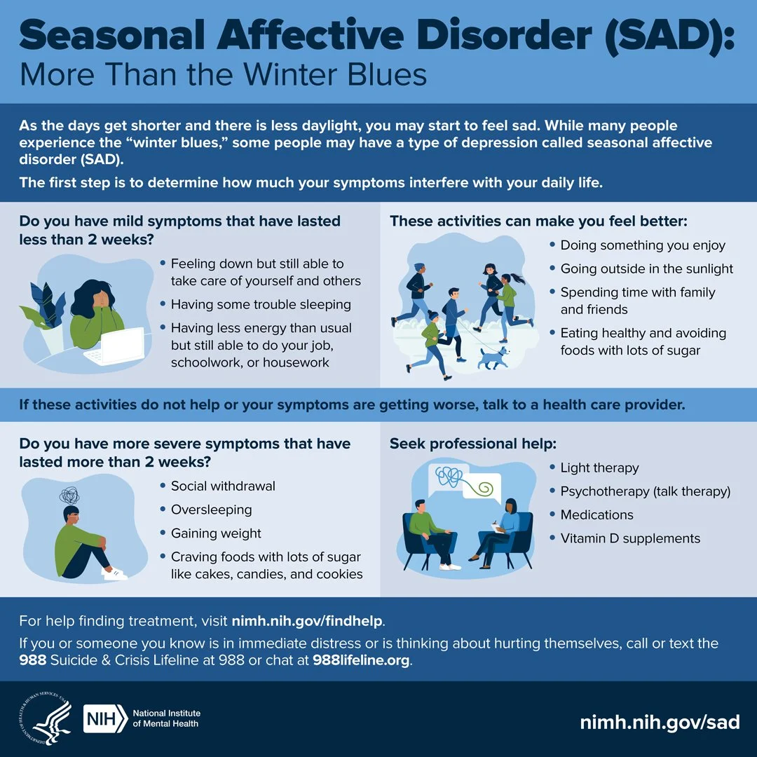
Seasonal Affective Disorder
Mental Health Information Design
Context:
An infographic created for the National Institute of Mental Health to make information about Seasonal Affective Disorder (SAD), symptoms, self-care, and treatment options easier to understand and navigate.
My Role:
I developed the visual concept, information hierarchy, layout, typography, color palette, and adapted the illustration approach to fit within brand guidelines.
Process:
Organized symptoms by severity and connected them to clear next steps.
Used a modular layout to make information easy to scan.
Paired illustrations with key messages to support understanding.
Created a consistent visual hierarchy across symptoms, self-care, and treatment.
Result:
The final infographic turns detailed mental health information into a clear, approachable visual pathway from recognizing symptoms to finding support.
Reflection:
This project reinforced how thoughtful hierarchy and structure can make sensitive health information feel more accessible without losing its importance.
SmartDose
Medical Device Information Design
Context:
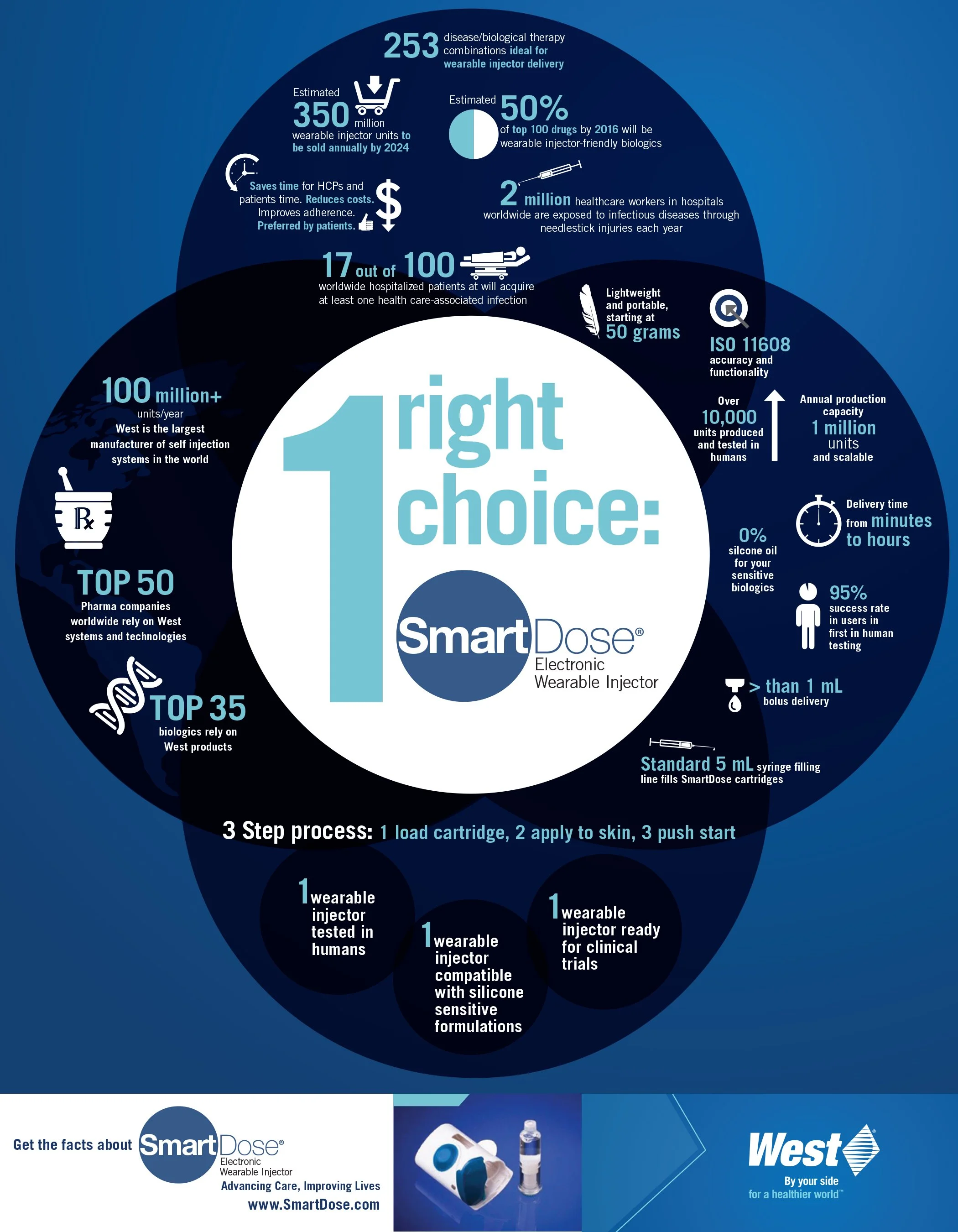
An infographic designed to simplify technical, market, and product information about the SmartDose Electronic Wearable Injector into one clear visual story.
My Role:
I developed the visual concept, hierarchy, layout, data visualization, typography, and iconography.
Process:
Organized dense information into focused content areas.
Highlighted key statistics with bold typography and icons.
Made SmartDose the central visual and messaging focal point.
Used overlapping forms and color to connect the information.
Result:
A cohesive infographic that makes complex product information easier to scan, understand, and remember.
Reflection:
This project demonstrated how strong hierarchy and visual storytelling can turn technical information into a compelling product narrative.
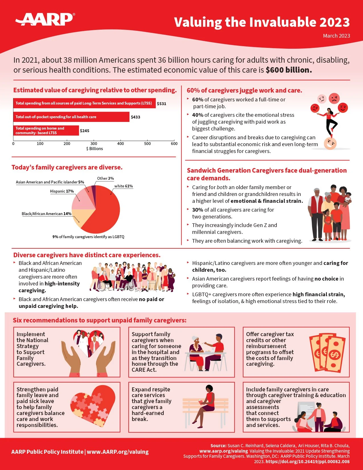
Valuing the Invaluable
Caregiving Data & Information Design
Context:
An AARP infographic designed to turn complex caregiving research, demographics, economic impact, and recommendations into a clear visual story.
My Role:
I developed the layout, visual hierarchy, data visualization, typography, color system, and illustration approach.
Process:
Organized dense content into clear thematic sections.
Highlighted key statistics through charts and bold typography.
Combined data and illustration to make the information more approachable.
Used a modular grid to guide readers from insights to recommendations.
Result:
The final infographic makes a large amount of caregiving data easier to scan, understand, and connect with.
Reflection:
This project reinforced how thoughtful information architecture and visual hierarchy can bring clarity to complex data while keeping the human story at the center.