Wellness for Life
An Energetic Identity for Healthier Living at Work
Project Goal:
Create a distinctive identity for a corporate wellness initiative that would encourage participation and make wellness communications feel active, positive, and approachable.
Context:
Wellness for Life was developed as a corporate initiative promoting healthy, active living among employees. The identity needed to stand apart from traditional corporate communications while remaining simple and recognizable.
My Role:
I developed the logo concept, symbol, typography, color palette, and visual identity.
Process:
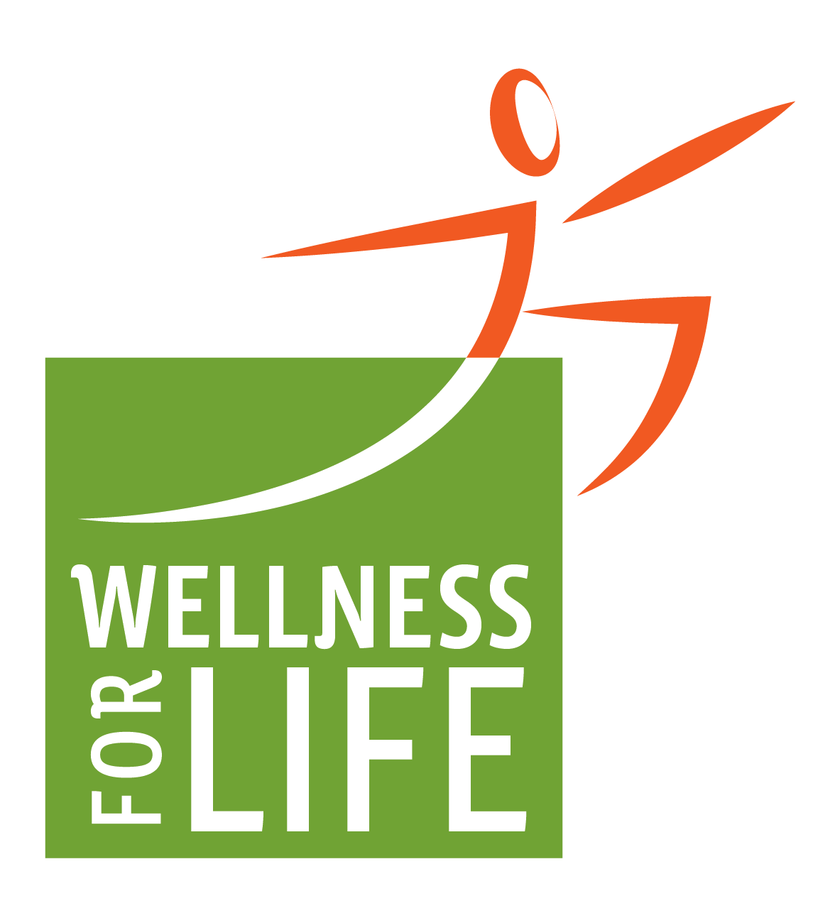
Created an abstract figure to suggest movement and vitality.
Used dynamic shapes to give the identity a sense of forward motion.
Paired vibrant green and orange for energy and visibility.
Integrated the symbol and typography into a flexible, memorable mark.
Result:
The final logo gives the wellness initiative a recognizable identity that feels active, engaging, and accessible.
Reflection:
This project showed how a simple visual concept can give an internal initiative its own personality and help make corporate wellness feel inviting rather than institutional.
Gateway Drive-In Theatre
Brand Identity & Logo Design
Project Goal:
Create a memorable identity for a drive-in movie theatre in South Africa that captures the nostalgia and fun of the classic drive-in experience while giving the venue a distinctive personality of its own.
Context:
Gateway Drive-In Theatre needed a visual identity that could immediately evoke outdoor movies, vintage signage, and the experience of going to the drive-in.
My Role:
I developed the logo concept, custom typographic treatment, color palette, graphic elements, and overall visual identity.
Process:
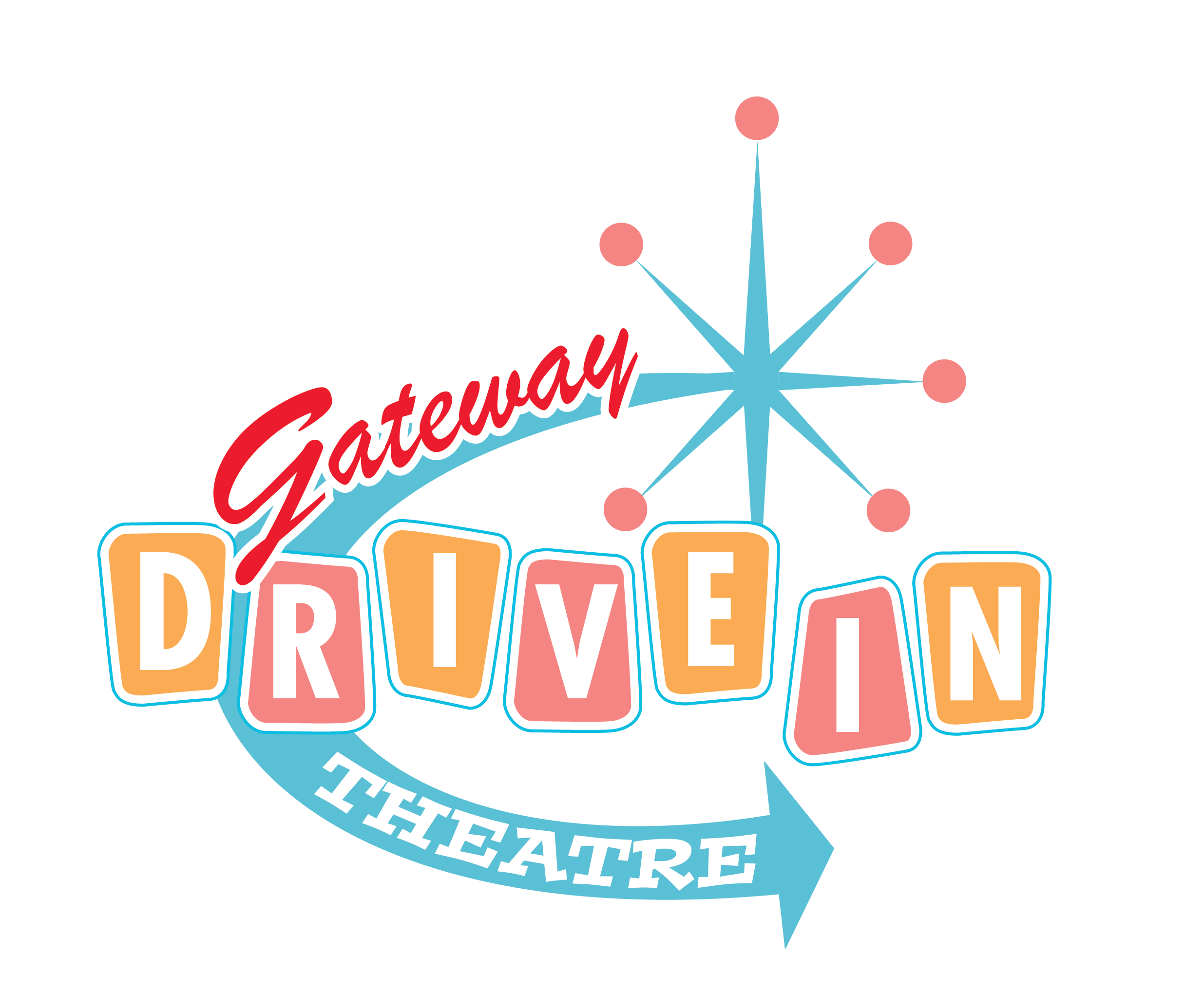
Drew inspiration from mid-century drive-in and roadside signage.
Mixed script lettering with bold geometric letterforms to create personality and hierarchy.
Used the starburst and sweeping arrow to suggest light, movement, and destination.
Chose a bright retro palette of turquoise, coral, orange, and red to give the identity energy.
Result:
The finished logo creates a playful, recognizable identity that combines the nostalgia of classic drive-in culture with the personality of Gateway Drive-In Theatre.
Reflection:
This project was an opportunity to use typography, color, and familiar visual cues to create a sense of place and experience. The combination of vintage-inspired forms and playful lettering gives the identity character.